• 1 min readPCF
canvascomponentnotificationux
Notification Bell Component (Canvas App)
A drop‑in bell with badge, popover panel, and keyboard support.
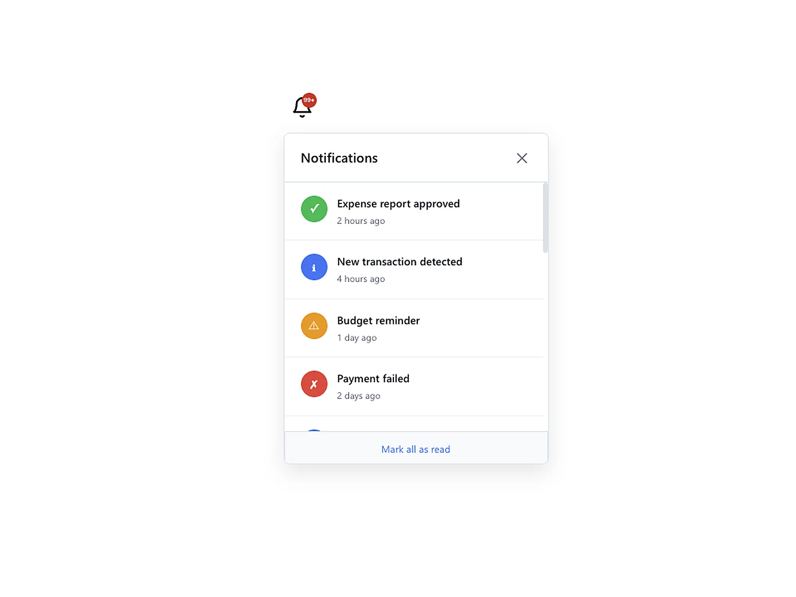
Live preview
Table Of Contents
A reusable notification bell for Canvas Apps with a badge and optional panel.
Features
- Badge positioning:
,TopRight
,TopLeft
,BottomRightBottomLeft - Custom badge offset and size
- Works with a collection of notification items
Copy/Paste Setup
// 1) Component inputs (example)
NotificationBell.HasNotifications = CountRows(colNotifications) > 0;
NotificationBell.NotificationCount = CountRows(colNotifications);
NotificationBell.BadgePosition = "TopRight";
NotificationBell.BadgeOffset = 2;

// 2) Sample data
ClearCollect(
    colNotifications,
    Table(
        {Title: "Expense report approved", Time: "2 hours ago", Type: "success", Icon: "✓"},
        {Title: "New transaction detected", Time: "4 hours ago", Type: "info", Icon: "ℹ"},
        {Title: "Budget reminder", Time: "1 day ago", Type: "warning", Icon: "⚠"}
    )
);
Notes
- If
, the badge shows the count even whenNotificationCount > 0
.HasNotifications = false - Panel positioning supports Left/Right anchor.
Happy building!